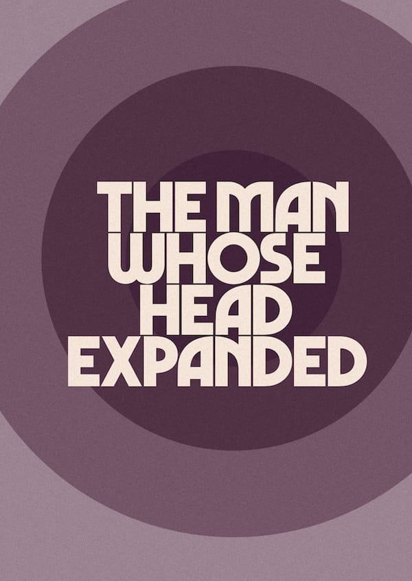
NOTES ON REVIVING MARVIN
by Mathieu Triay
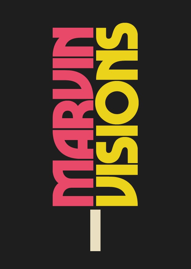
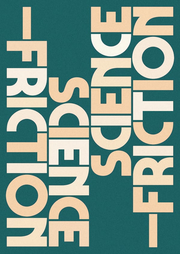
Visions is a new science fiction magazine that aims to introduce the genre to a wider audience. Mixing classic texts and new writing, its identity needs to reflect a breadth of styles and ideas.
During the research phase Kabel, Serif Gothic and Avant Garde quickly proved to be the typographical staples of the genre (together with a collection of more unusual ones). To a degree these typefaces, along with the often lavish illustrations, have given science fiction its look in the collective mind. To reach a new audience, SF needs a new image. The well established one is unfortunately also associated to a lot of clichés that put off some otherwise interested people. The quest for a typeface that could tread the line between a modern look and a retro feel had begun.
Ideally, you’d want a classic with a twist. Something that’s a bit like Kabel, sorta like Serif Gothic, and with the impact of Avant Garde. Marvin doesn’t really tick all these boxes but it somehow captured my imagination as soon as I spotted it. I felt a hint of science fiction about it, only realising later that it had been used for that purpose. But more importantly, I could sense something mysterious, and maybe even comical, hiding inside it. Unfortunately there was no proper digital version available. Everything out there was poor and somehow managed to suck the life out of it. That’s why I decided to look for what made it magical to my eyes.
Analysing Marvin
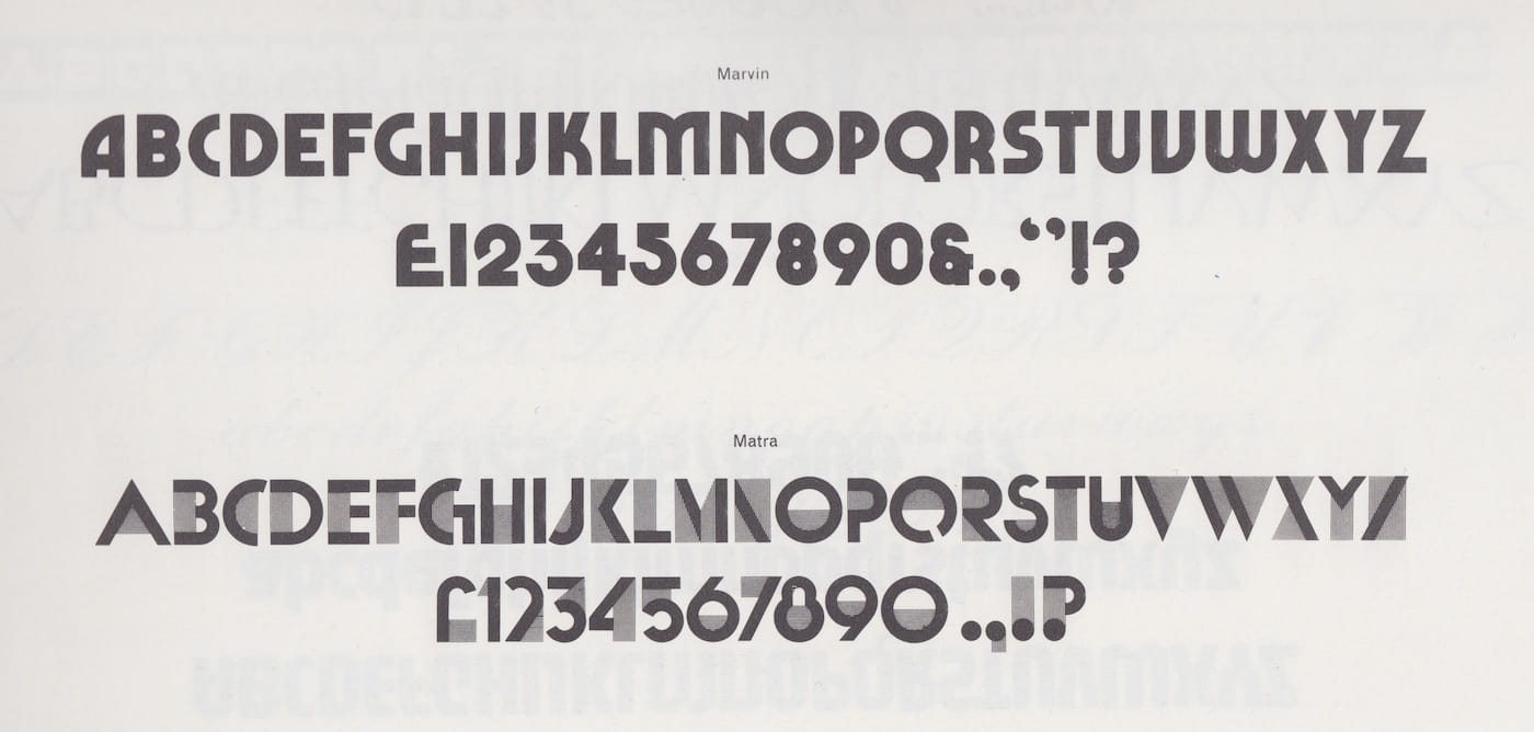
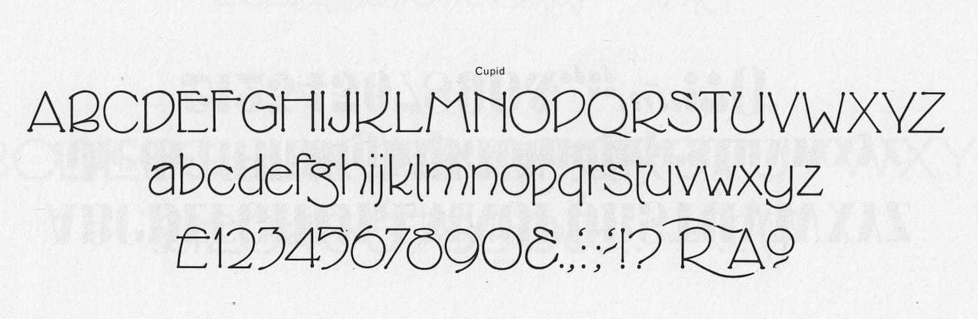
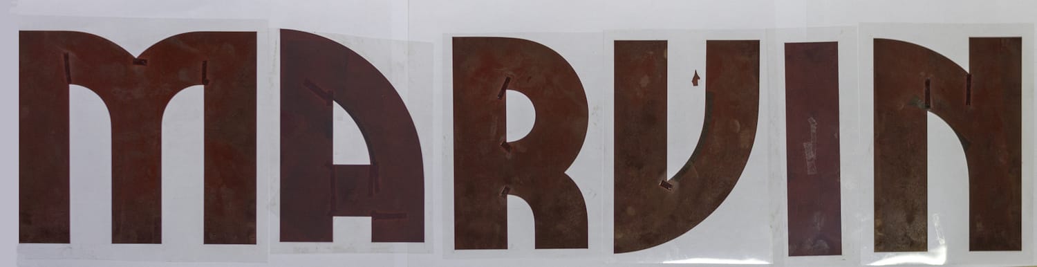
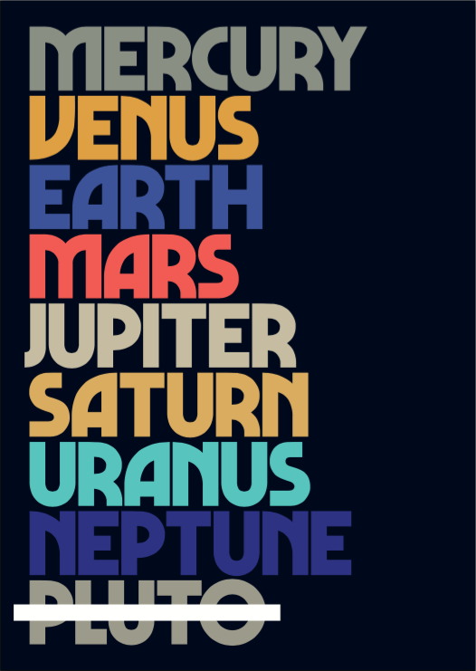
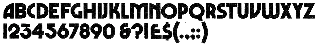
Marvin’s letter shapes aren’t new. You’ll find clues to its origin in the Art Nouveau movement, but not only, as it seems to draw inspiration from a variety of styles. Typefaces like Desdemona (1886) revived by David Berlow (1992) exhibits a major source of inspiration. Probably not a coincidence that Desdemona was first revived by Face, the original publisher of Marvin. It has friends in the popular Busorama (1970) and the obscure Pinto. It’s a cousin of Pump (1970) and is on a first-name basis with Blippo (1969), as well as some non-identified siblings.
Marvin gets its distinctive voice not only from its Art Nouveau vibe but also from its almost geometrically perfect construction. Its roundness and familiarity with Bauhaus typefaces shows its roots in geometric sans serifs at the same time. Typefaces inspired by the Art Nouveau lettering are usually built with a brush stroke — a handmade feel that could transport you to Paris. The original Marvin doesn’t care much for brush strokes. It’s built like a tank with fat stems, little to no optical correction and a C that’s simply half of the letter O. Marvin doesn’t have the time to dilly‑dally.
I only managed to find a handful of examples in use but the vast majority uses the Lubalin-esque tight-not-touching style. Maybe to support that trend, Marvin had generally narrow, plump, letters – a structural decision that can help to reduce the white space between the shapes. By going away from Roman proportions and with the limitations of a seemingly modular typeface constantly re-using bits of itself to build itself, Marvin had a few letters that felt awkward. Whether it’s because of the rigidity of the construction or not, letters like P, R, C, K, Y were much narrower than the rest, producing an uneven rhythm within words. After closer inspection, the curve on the A and V (which looks like it’s simply been flipped) leans in, flattening the shape as it curves. Creating more white space above the curve felt inconsitent with the intent of use with tight spacing.
These details (or flaws) could be part of what made Marvin and its charm, but I thought the design could benefit from a fresh perspective. I wanted to solve the problems I could see at a glance: how to bring Marvin’s character to the modern world? How would it work online? At different sizes? How would it work with different languages, diacritics, etc.? How can I make it sturdy and versatile?
Redesigning Marvin
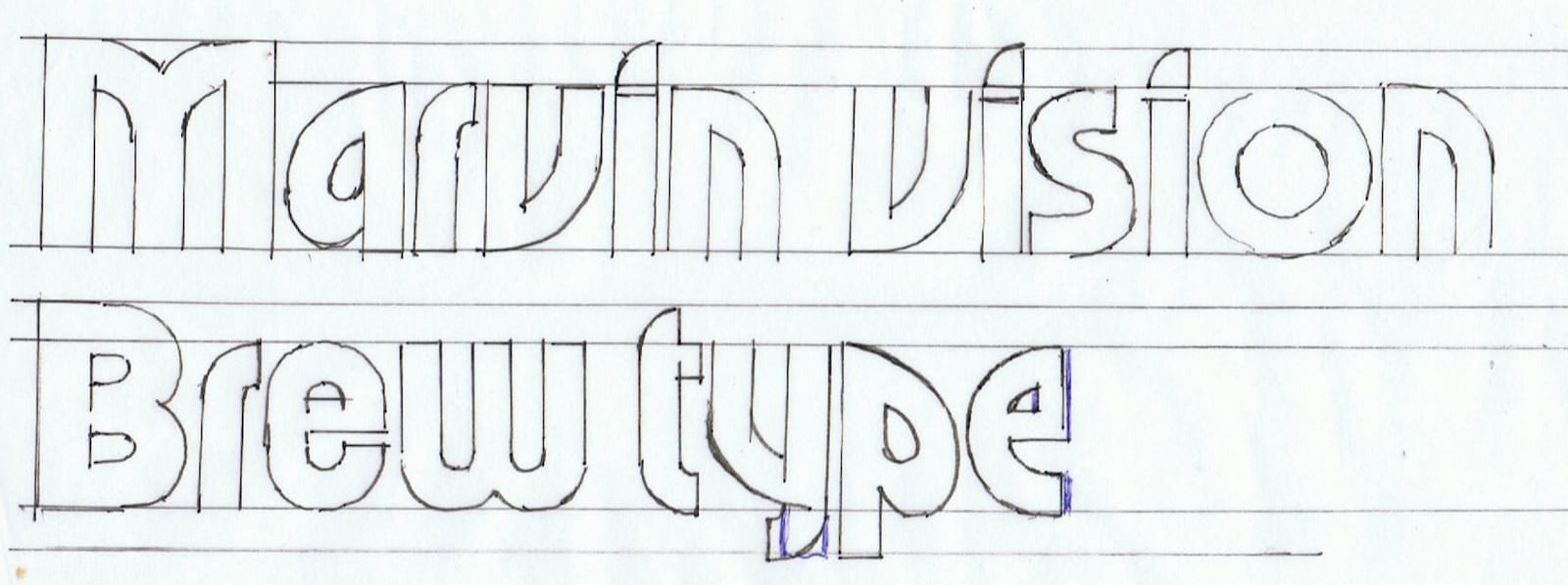
With a specimen provided by Tom Etherington in hand, I started by following the shapes closely and drew what I saw. If you know a little about type design, you know that it’s often recommended to start drawing H and O first. They’re not the most exciting to design but they inform the vertical, horizontal and round strokes throughout the typeface. Moreover, this is where you’re likely to start when spacing the font.
I knew a decent amount about typography, but not a lot about type design so I started with the letter that fascinated me the most: the A.
The A Team
The first things that Marvin shows you – and they’re in the name – are its A, N and V. My instinct was that the magic was hiding in there and it was crucial to get these letters right. As soon as my first printed specimens came out, I started to see issues. The words had no balance and some letters, like the tower of Pisa, were about to topple.
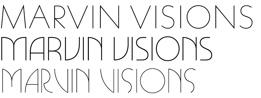
I had a different image of Marvin in my head. For me, it had strong and sturdy shapes, sure on their feet. The narrowness and the flatness of the curves reduced the counters when my idea of Marvin was more open and maybe more ‘Roman’. I particularly wanted larger counter to increase its readability and friendliness so it could be used in different contexts. As a result, Marvin Visions is based on the initial impression that Marvin made on me rather than a true reproduction of its lettershapes.
With over 42 different versions, the A was one of the most time consuming glyph. The task was to find a curve that could fit A, V and N whilst maintaining the impression of visual harmony. They have a wider, more pronounced curve that feels smooth throughout, arching over the stem. It creates space inside the letter and closes the gap you’d have next to shapes like T. Obviously the curve couldn’t be transplanted to the V and N without being adjusted, paying particular attention to the joints and shoulders.
The cog in the night-time
When I started to work on the O, I was surprised by its simplicity. This was a round, unapologetically geometrical shape. Wide, with a generous counter, to the point that any idea of an overshoot had been forsaken. A perfect circle inside another, the pinnacle of geometric sans-serifs.
However, there are very good reasons why circular shapes need special treatment in terms of design and I couldn’t dismiss them completely. I tried to keep the outside circle as perfect as possible, in line with the original intent, and focused on the counter to compensate the optical illusions. The resulting shape should still look very much like a perfect circle with a more mathematical approach to the solutions offered by the likes of Futura and Johnston.
There’s only so long you can look at the word COG without going mad. The rounded shapes were redesigned together with the idea that the O could overshoot minimally but the G and C should rest on the baseline and meet the cap height like other letters to keep visual harmony and consistency. Because of the white space either side of the O, the overshoot is not really noticeable but helps to lift it to the level of the other letters. When it came to the C, whichever way you cut it, the half-circle had a tendency to be troublesome: it looked squashed by two towering forces when used in the middle of a word, breaking the rhythm. Following my idealised Marvin, I extended it a fraction in order to give it more room to breathe next to letters with a straight stem.
The PRYKX
is right
The general narrowness of R, P and K made them feel cramped, almost as if they were from a compressed weight by comparison. Starting with the X and Y, I widened the aperture at the top to better match the general width of the typeface. The idea wasn’t to turn this into a sort of monospace font. I simply wanted to be mindful of the space each of these letters needed to express themselves, using something closer to Roman proportions for consistency.
If you were to draw an R, would you just tack a leg onto a P? Maybe. They share some of the same DNA after all, but it doesn’t mean they have to be clones. If you don’t consider what you want the R to look like first, you increase the chances of the leg sticking out like a sore thumb.
Marvin suffered from that because that’s exactly how it had been built. The resulting shape was definitely too narrow to accomodate the leg and looked strange at the start or end of a word. To remedy this, I sketched the proportions of the R first and built the P based on these. I then went back to the R to finish the job, taking care of adjusting the curve to account for the thickness of the joint.
26 sailors,
33 soldiers
It only took a few weeks for me to get a full alphabet, but I could see and feel that something wasn’t quite right. I needed to cement my vision of Marvin to get it looking the way I imagined it. Examples in use that could guide me were hard to find, particularly because I didn’t know where to look. I decided to let the project sit for a while.
On holiday in Ukraine I found this box for a model boat. I didn’t care for the inside as much as I did for the outside. This was the first time I saw Marvin in the wild and it was in Cyrillic. I still haven’t resolved how or why or even who but the fact is: someone made a Cyrillic version of Marvin and it was used to sell model boats. Note the inverted V to make the ‘El’, continuing what had been done for the A, V and N.
I spotted Marvin a second time on that trip, in giant letters on the side of a lorry. Ritter Trans, an Austrian transport company uses Marvin as its logotype. Again, I have no idea how they maintained this in the digital age but here it is. When I came back, I was ready to tackle the project again. Based on the box and research on the alphabet, I drew a set of Cyrillic glyphs. It came out spikier than latin Marvin but also somehow cooler and prompted me to start looking the latin alphabet again.
Ready for international waters
After the Cyrillic, it only felt right to try to get Marvin to speak as many languages as I could. The Letraset specimens showed a few diacritics but again I couldn’t find any of them in use.
When I first drew them based on the original ones, they felt off. They didn’t have the renewed strength of rest of the typeface. They looked a little too apologetic and forced me to improvise. For the acute accent for instance, it was necessary to stray a little from Marvin’s rigid build. It now flares up slightly as it goes higher, with more of a slant helping to make it more recognisable.
Thanks to Toshi Omagari’s expert advice, the general look and feel of the diacritics has improved dramatically. One of them is particularly worth highlighting: the ogonek. If a glyph has a brush stroke in its DNA it’s this one and it doesn’t really jam with steamrolling Marvin. Luckily, research showed they can be more graphic in display faces, sometimes reduced to a square or rectangle. It was an opportunity to bring out the curve from the A again, reducing the ogonek to its simplest movement.
The circumflex accent has a pointy top, as is usual in written French. The caron, unexpectedly maybe, didn’t inherit the same shape and got a flat bottom instead. That seemed to be the preferred form for languages using it and was a better fit for Marvin too.
Finally, The german double S (know as eszett) was an interesting one to draw. Until very recently there wasn’t an official capital version of the uppercase ß in a single glyph. It’s not a new letter and there are extensive articles on the history of it. The debate is still happening it seems, but the fact is, ẞ is now part of the German letterset, so Marvin Visions supports it.
Nearly D@&€!1!1
The specimens I could find only had a handful of punctuation marks but I had no luck finding them in use once again. The comma, in particular, was a problem. It looked great on its own, but as part of a sentence it looked too much like a full stop. It was so round it couldn’t fulfil its role. I particularly wanted a flick in the tail, feeling that a slightly diagonal stroke was important to the semantic meaning of it. The one that made the grade was derived from the original, retaining its roundness with an exaggerated tail. The same comma worked perfectly as a quote mark. For the comma accent, it would have been easy to keep using that new design but it was reaching too far down. Instead I went back to the initial comma and there it looked right at home.
The ‘at sign’ – or as they say in Romanian, the monkey tail – was an interesting challenge. Usually the lowercase ‘a’ would be your starting point, but Marvin being uppercase only I had to come up with something different. The final design embraces the circular nature of the glyph and Marvin’s affinity for perfect circles. Looking forward to seeing that on a business card!
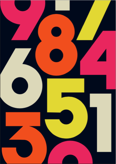
The figures were a different kettle of fish and had to be redrawn entirely. The 2 and 3 had a great look to them but didn’t feel balanced. The 1 looked like a capital I, the 5 needed a serious face-lift, the 4 had some thickness problems. The rest was workable but needed correcting. It became an optical game to fit in the thickness necessary for the strokes but keeping the width consistent and the counters large enough.
Spacing Oddity
The spacing came very late. Type designers usually recommend to space as you draw, finding the right fit one glyph at a time. It makes sense, and the process would be less painful because you don’t have to tackle it all at once. That’s something I didn’t know, so I ended up with a full alphabet and no spacing at all. Professionals also say ‘drawing is spacing’ by which they mean your drawing decisions – the white space inside and outside the letter – will influence how tedious the spacing process will be. Luckily, I had that intuition from the beginning with the adjustments I wanted to make to the A.
Using Walter Tracy’s method, I worked out a first spacing that was pleasant, not tight but not too loose either. My theory about the openness of the counters and the more consistent width of the glyphs proved to be fruitful. It looked good, and worked even at sizes of 24pt on paper. The problem was that it’s generally harder to tighten a looser font (causing collisions) than to track a tight one. Marvin is best suited for display sizes and giving it a tighter default spacing made more sense for the release. I kept the idea of a looser spacing for the sub-headline family where lighter weights will appreciate the room and started working on the current tight spacing.
Bang
The result of that process is a more consistent Marvin. It has larger counters and strong, stable shapes. It’s a little more versatile, will look great on screen and in print, and it can be tracked without completely collapsing. It retains the charm and genial look of its forefather but brings its distinctive feel into the digital world with a bang.
All of this wouldn’t have been possible without the tireless support, feedback and encouragement of Claudia Toia, Matthew Young and Tom Etherington. Thank you.
I also want to thank Toshi Omagari and Nadine Chahine for their friendliness and professional advice that transformed a personal project into what it is today. Thanks also to Canada Type for letting me use the name Marvin Visions, check out their very different Marvin.
Lastly, thanks to McConnell Studio for going out of their way to help me identify the original designer of Marvin, which I unfortunately haven’t managed to get in touch with. Michael Chave, if you’re out there, I’d love to chat!